New car interiors have changed dramatically over the last decade. Where dashboards once had rows of buttons, switches and analogue gauges, most new cars now put almost everything onto one or more screens.
Touchscreens are no longer just for stereo controls and navigation. In many cars, they now control climate settings, mirror adjustment, driver assistance systems, vehicle settings, user profiles, charging menus, ambient lighting and plenty of other functions.
At the same time, most new cars have replaced traditional analogue instruments with digital driver displays. Some models have even replaced rear-view mirrors with camera-based screens, meaning that another long-standing piece of simple, reliable hardware is being turned into a digital display.
None of this is automatically a bad thing. Screens can offer more information, more flexibility and more functionality than old-fashioned buttons and dials. But too many car manufacturers seem to have decided that because screens can do almost everything, they should do almost everything. That’s where the problems start.
A car is not a phone, a tablet or a laptop. It’s a complex machine being used at speed, often in heavy traffic, bad weather or poor light, by people who need to keep their attention on the road. In that environment, a screen-based control system has to be judged by a higher standard than whether it looks clever in a design studio.
At the moment, too many cars are simply not good enough.
Screens are harder to read at a glance
A good analogue speedometer or physical gauge can be read almost instantly. You don’t need to study it because your eyes know where to look, your brain processes the information quickly and your attention returns to the road.
A screen is different. It can show far more information, but that’s not always helpful. Many digital driver displays are cluttered with graphics, menus, animations, economy readouts, map information, media details and safety-system icons. Somewhere in the middle of that, often in a font that’s far too small, is the information the driver is actually looking for.
This is simply poor design. Too many car makers use screens as a space to show off, rather than a tool to make driving easier. It becomes especially frustrating when the driver has no proper way to simplify the layout.
At the very least, every digital driver display should offer a simple, high-contrast view with large fonts and minimal information. Speed, fuel or battery range, warning lights and essential navigation prompts should be easy to read at a glance. Anything else should be optional.
Drivers should also be able to scale up font sizes properly, and it shouldn’t be a hidden accessibility setting buried three menus deep. It should be a normal part of setting up the car.
Touchscreens are impossible to use without looking
Physical controls have one huge advantage: you can feel them. Once you know where the heater control, volume knob or mirror switch is, you can often use it without taking your eyes off the road for more than a second, because your fingers do a lot of the work. The shape, position and movement of the control all tell you what’s happening.
A touchscreen doesn’t work like that. A flat glass panel feels the same wherever you touch it, so you have to look at the screen to find the right icon, check you are on the right page and confirm that the car has registered your input. Every single time.
That might be fine when you are sitting in a showroom or parked in your driveway, with nothing to divert your attention from operating the screen. But it quickly becomes a problem when you’re trying to do all that while driving along a road with other traffic and lots of other things to look out for.
Making the screen bigger doesn’t automatically solve the problem, especially if manufacturers simply cram more functions into the available space, or devote three quarters of the screen to a wallpaper image. A large screen with tiny icons, small fonts and several menu layers is still a poor control system.
The obvious example is the climate controls. Adjusting temperature, fan speed or demisting should not require careful aim, multiple taps or a trip into a submenu. These are basic car functions, used regularly while driving, so they need to be quick and obvious.
Too many systems are designed for the showroom, not the road
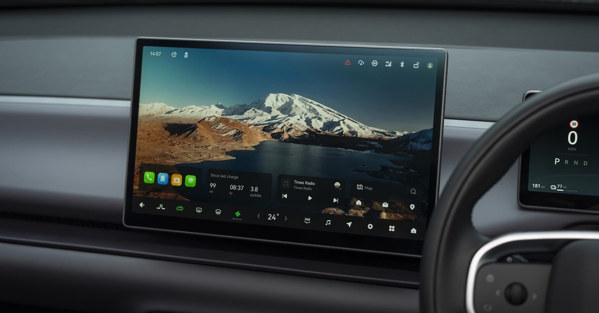
Many modern infotainment systems look impressive when the car is parked. They have colourful graphics, smooth animations and dramatic home screens showing a picture of the car, a forest, a glacier or some other lifestyle image taking up most of the display, while the useful controls are squeezed into a strip along the bottom of the display.
On the road, that’s useless. The home screen should help the driver do what they need to do quickly. If the useful buttons are squeezed into a small strip or tucked around a large decorative image, the system has failed at its main job.
Apple CarPlay and Android Auto are much better at this than most manufacturer systems. Their app icons are large, recognisable and spread across the screen. The layout is familiar to most users, and the whole system is built around getting to a function quickly. That’s exactly what you want when you’re driving.
Car manufacturers need to learn from that, and it’s surprising that none of them seem to have done so over the last decade. Too often, native systems prioritise brand identity and visual drama over clear everyday usability. I don’t need to admire a digital render of the car I’m already sitting in. I need to find the button I want and make an adjustment without taking too much attention away from the road.
Many new cars have been designed around customer expectations in China – not just Chinese-brand cars, but European cars targeting sales in the huge Chinese market – where large central touchscreens and button-free dashboards are considered more desirable. But feedback from UK and European drivers has been strongly against the everything-on-a-screen approach, and it feels like we’re putting up with a car designed for someone else.
It seems unfair to highlight any particular brands and models, as this has become an industry-wide issue. Over the last couple of months, I’ve driven cars from BMW, BYD, Citroën, Leapmotor, Mazda, Mitsubishi, Nissan, Peugeot, Volkswagen, Xpeng and Zeekr, and they all suffer from the same issues to a greater or lesser degree.
Screen failure can now mean losing basic functions
In an older car, if the radio failed, you lost the radio. You didn’t lose the heater controls, mirror adjustment, trip computer, safety settings and half the car’s basic functions at the same time.
In many newer cars, the central screen has become the gateway to almost everything. If it freezes, crashes or fails completely, the driver can lose access to a huge amount of functionality – sometimes even including your speedometer.
That’s not just annoying. If all that information disappears, the car may no longer be legal or safe to drive. So car companies need to build in proper redundancy. Essential driving information and basic safety-related functions should not depend entirely on one screen behaving itself.
This is where old-fashioned controls had a major advantage. A physical heater switch might not have been glamorous, and it certainly wouldn’t impress anyone during a product reveal, but it did one job and kept doing it regardless of whether the radio, navigation or door mirror controls decided to have a moment.
There are good points to digital systems
None of this means screens should disappear from cars – and let’s face it, they’re not going to. Screens can bring genuine benefits when used properly, so it’s not about pretending that old dashboards were perfect. It’s about using digital systems where they improve the car, rather than forcing every function through them even though it makes the experience less effective or less safe.
Digital systems allow cars to offer features that would have been impossible with old-fashioned dashboards. Drivers can adjust locking settings, lighting preferences, driver assistance warnings, charging schedules, display layouts, user profiles and more.
Digital driver displays can show navigation prompts, media information and trip data more flexibly than analogue gauges. They can change between day and night modes, switch units from mph to km/h for continental driving and present different layouts depending on what the driver wants.
If you’ve ever used an old-school navigation system that doesn’t have a keypad, you’ll remember how slow it was to twist a dial or repeatedly tap a key over and over again to enter every letter or number of your destination. A touchscreen keypad makes that job much faster and easier, and this is exactly the sort of task where a touchscreen is better than a traditional control.
Phone-based systems such as Apple CarPlay and Android Auto are also valuable. They let drivers use familiar apps for navigation, music, podcasts, calls and charging-point information, which can make long journeys easier and less frustrating. A good car interface should work with those systems rather than trying to bury them behind a manufacturer’s own less useful layout.
Digital mirrors can also have advantages. A camera-based rear-view mirror is not obstructed by passengers, head restraints, luggage or shallow rear windows. It can also adjust for poor light or glare from following vehicles. In the right car, with the right display, that can be genuinely helpful.
The best modern interiors combine both approaches. Screens work well for navigation, media, charging information, detailed settings and personalisation, while physical controls work better for frequent, safety-relevant or time-sensitive functions. This really shouldn’t be a difficult distinction.
Cost is a big factor
Car companies often say customers like screens, especially younger buyers. That may be true to some extent, and it certainly seems to be true in some markets, particularly in China, where large screens and minimalist interiors are common.
But there’s another reason manufacturers like screens: cost. A dashboard with one or two screens is much, much cheaper than having rows of buttons and switches, and a multitude of dials and gauges. Whether customers like it or not is far less important to the beancounters at major car companies than saving a few pennies.
It also allows manufacturers to update features later through software delivered directly to your car via the cloud (known as an over-the-air update), rather than redesigning physical hardware or forcing a customer to visit a dealership to fix a problem. That saves money and makes sense from a manufacturing point of view, but it doesn’t automatically make life better from a driver’s point of view.
There’s nothing wrong with using software to improve a car. Over-the-air updates can fix bugs, improve functions and add features. But they should not be used as an excuse for launching cars with poor interfaces, missing physical controls or basic functions hidden in badly organised menus.
Increasingly, that’s what we’re seeing. New models are being pushed out to customers with software that’s buggy or poorly thought out, followed by a hasty fix delivered a few weeks or months later after criticisms from motoring journalists and customers. That may be normal in consumer electronics, but it’s a much bigger problem when the product is a car that people use every day in fast-moving traffic.
What car makers need to do better
The solution is not to turn the clock back to dashboards from the 1990s. Some of those old systems were clumsy, ugly and limited, and plenty of modern screen-based features are genuinely useful. The solution is to use screens where they’re helpful, and physical controls where they’re better.
Core functions should have proper physical controls, or at least permanent touchscreen controls that are large, always visible and easy to use. Temperature, fan speed, demisting, volume and hazard lights should not be buried in menus. Nor should common driving functions that need to be adjusted regularly. If a function is likely to be used while driving, designers should assume the driver has only a second or two to find it and use it.
Digital driver displays should be clearer, simpler and more adjustable. Every car should offer a large-font, low-clutter mode as standard. If a driver wants more information, they can choose it. But the default should be easy readability.
Touchscreen home screens should be designed around function, not decoration. Large icons, clear labels and logical grouping are more useful than wallpaper images and animated graphics. If a function is important enough to use while driving, it should be easy to reach in one or two actions. If designers are desperate to have splashy graphics and wallpapers, these can be activated when the driver engages park to stop driving. But on the move, function must take priority over form.
Manufacturers also need to think harder about used car buyers, rental drivers and anyone who does not get a detailed handover from a dealer. A good interface should not require a training session, and if a driver has to sit in the car for 20 minutes working out how to adjust the mirrors, switch off an overactive warning or change the air vents, the design has failed.
Voice control can help, but it’s not a complete solution. It needs to work reliably, understand normal speech from every customer and avoid making drivers repeat themselves. None of the systems I’ve ever tried gets close to achieving all of the above. They come across as a party trick rather than a proper alternative to a button.
Most importantly, car makers need to stop assuming that removing buttons is automatically progress. Sometimes the best interface is still a switch you can find without looking.
The bottom line
In-car screens are here to stay, and they can make cars better. They can add useful features, improve navigation, support phone apps, personalise settings and make electric cars easier to manage.
But too many current systems are harder to read, harder to use and more distracting than they need to be. Small fonts, cluttered displays, hidden menus and over-styled home screens are not signs of progress. They’re signs that design has been allowed to get ahead of usability.
Screens should support the driver when on the move, not compete for attention. If I want to move air away from my face, I want to physically grab the air vent and adjust it. I don’t want to tap into the climate control menu, then go into a sub-menu or second page to find the air vent controls, then drag my finger around the screen to point the air in a different direction, then find my way back to the home screen again. Yes, this is an actual thing on several new cars today.
Until more car manufacturers understand all this, in-car screens will remain one of the most frustrating parts of many new cars. If car companies would design their screens and input systems around driving, rather than looking impressive in a showroom, it would be a big improvement.